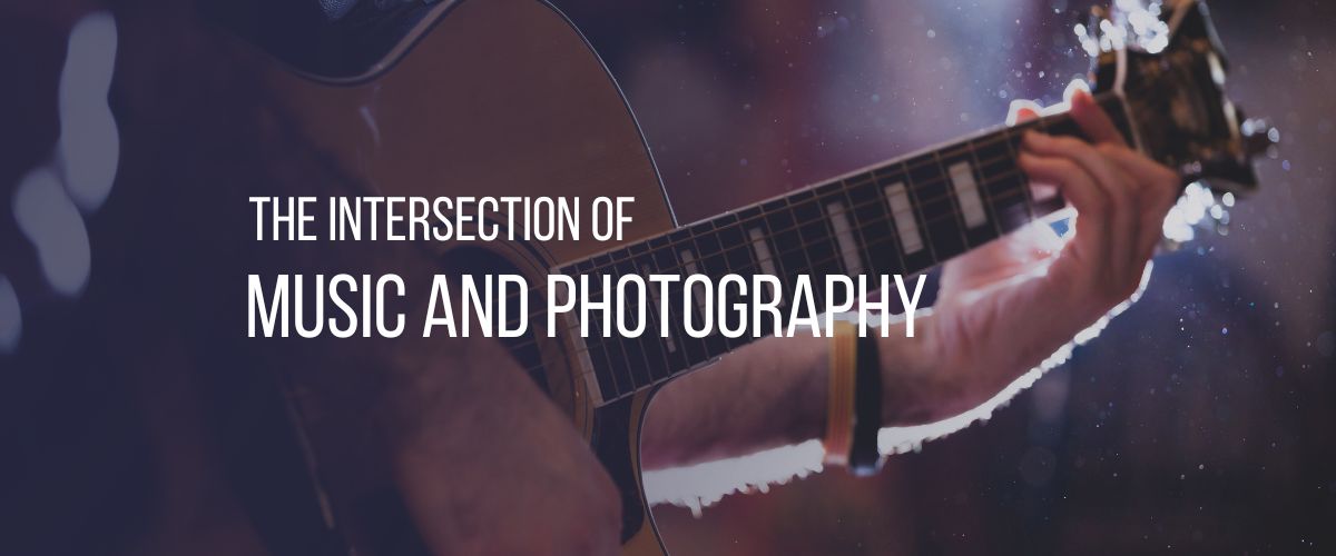
The very first thing that makes you want to watch and click on a video on YouTube is the thumbnail of the video. A YouTube thumbnail not only gives the viewers a preview image of the content of your video, but it also plays an important role in forming the first impression of the video in the minds of the viewers. Thumbnails are like the salesperson on YouTube whose job is to attract the audience and convince them to watch the video. They have the power to either make or break your video. Making and selecting the right and apt thumbnail for your YouTube video is one of the most crucial aspects as it has many underlying factors that one needs to keep in mind so as to boost the views of the video.
Importance of a thumbnail
A thumbnail holds a lot of weight when determining the success of the video. It is the first thing that viewers tend to notice when they browse through the videos in their feed. A good thumbnail makes people want to watch that video among all the other videos present in their feed. Another reason as to why they are important is that if you are producing high quality content in your YouTube videos but have average, commonly-used visuals in your thumbnail, then the audience might not want to check the video out simply because of the poor thumbnail.
However, the opposite is also true – you can use good thumbnails to attract an audience and increase the viewership of your videos. An attractive thumbnail itself will make the viewers want to click on it to check out the content of the video. A nice, customized thumbnail can always level up your YouTube game making your feed look more professional, thus increasing viewership and subscribers.
How to select a Thumbnail for your YouTube Video?
1. Don’t go for the default thumbnails!
YouTube has a feature where it will by default select a thumbnail for your video while uploading the video online. This thumbnail, however, will be a still shot of any one randomly selected instance from your video that you are uploading. But this might certainly not be the best way to select a thumbnail. For example, if a person is talking in the video, the default thumbnail will select a moment or still image from the video where the person is in motion and so the thumbnail will have an awkward facial expression. This happens in most cases of default thumbnails and is definitely not attractive and professional. Even though your video might be really good, a default thumbnail might just degrade its level.

2. Customize your thumbnails
This is where you actually make the difference and give your YouTube videos the spark. A customized YouTube video has all the benefits from gaining more viewership and subscribers to making your YouTube feed look consistent and bold. One can go all creative when customizing their thumbnail by using well planned shots or images, a dash of vibrant colors to make it look attractive and most importantly a bold and enticing heading or title to your video to attract the curious audience and make them want to watch your video. Think of yourself as the audience and how you would like to click on an attractive customized thumbnail over a boring randomly chosen default thumbnail. After all it’s like a race, the best thumbnail wins the most views! If your video is about an artwork that you created, you can show a picture of yourself doing the artwork along with a catchy title in a bold font with a few stickers of paints and brushes. This will automatically look more creative, making the audience want to click and watch the video.
3. Combine video stills with graphics
This is one of the most used customized options on YouTube, wherein one curates the thumbnail in such a way that one combines still images from the video at the same time using graphic elements to create an alluring thumbnail to attract the audience. This option has recently gained much popularity among YouTubers, especially those creating vlogs, tutorials or talk shows and podcasts. For example, if your video is about cooking, use small, animated graphics of food items along with a still from the video. This will make your thumbnail more creative.
Graphics like these always add to the overall look of the thumbnail making it attractive.
4. Use striking and eye-catching titles
One of the most important components of a good thumbnail is a striking title or heading that the audience is going to read and will automatically make them want to watch the video.
Having said that, the thumbnail title is not supposed to be confused with the YouTube video title. While the title of the video goes separately and can be longer, the thumbnail title is the one that can be seen on the thumbnail and has to be short, crisp and to the point. When the viewer is scrolling through the videos, it is the crisp and easy-to-read thumbnail title that catches the attention of the viewer leading them to click on your video. While editing your thumbnail, keep in mind the font and its size so that they look bold and clear when your video is posted as the thumbnails appear smaller when searched for on YouTube. A thing to not do here is to make your thumbnail titles too long as it can look clogged up on the final thumbnail making it unable to read clearly from far.
Selecting the right color for the text is also important as it should be clearly readable and not camouflaging with the background.

5. Avoid using misleading titles and images
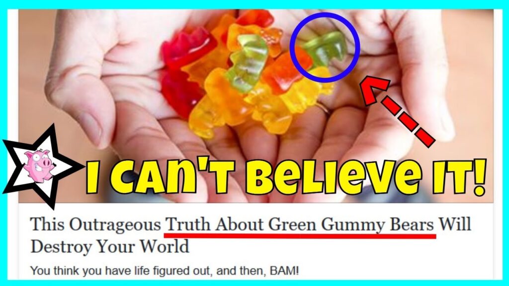
It is also very important to remember the connection between what you show in your thumbnail and what is in your video. One can get carried away and to attract more and more views one may make use of false or exaggerated titles and images in their thumbnails. YouTubers often use ‘clickbait’ in the titles of their videos which are basically headlines or titles that grab attention and intrigue viewers with curiosity making them want to click and watch the video.
Misleading titles may lead to dislikes and negative comments due to dissatisfaction among the viewers while using images originally published by someone else online can lead to ownership issues. Some of the commonly used clickbait examples are “You Need to See This”, “This is Shocking”, “X Reasons why…” etc. Many times, usage of exaggerated and extreme titles and images can also scare away a potential audience. The key is to be authentic yet smart with your title and images.
6. Find your style and be consistent
An additional tip but also an important factor to keep in mind is the consistency of thumbnails. Each YouTuber has a different style when it comes to thumbnails that makes the feed on their channel look attractive and organized. Once you have experimented with a few different styles and have finally found your style of thumbnails, stick to it for most of your videos. This will create consistency in your style allowing your viewers to distinguish your videos from the rest and at the same time adding your personal touch to the feed arrangement on your channel. Viewers will watch one video after the other on your channel leading to more subscriptions.
To conclude, the thumbnails of your YouTube video are much more significant than they seem to be. These tiny preview images are the ones doing the job to attract more and more viewers to watch your video. Hence, one needs to keep in mind certain tips in order to have a great impression with thumbnails. So find your thumbnail style, be consistent with it and watch your channel grow!


