Photography is an art that captures the essence of a moment or a subject. However, taking a great photograph involves more than just pointing and shooting. Composition is one of the essential elements that separates a good photograph from a great one. In this blog, we’ll explore the composition essentials photographers shouldn’t ignore.
Why Is Composition So Important?
Composition is one of the most important elements in photography. It is the art of arranging various visual elements in a photograph to create a compelling and balanced image. Composition plays a critical role in determining the overall look and feel of a photograph and can make or break the impact of an image.
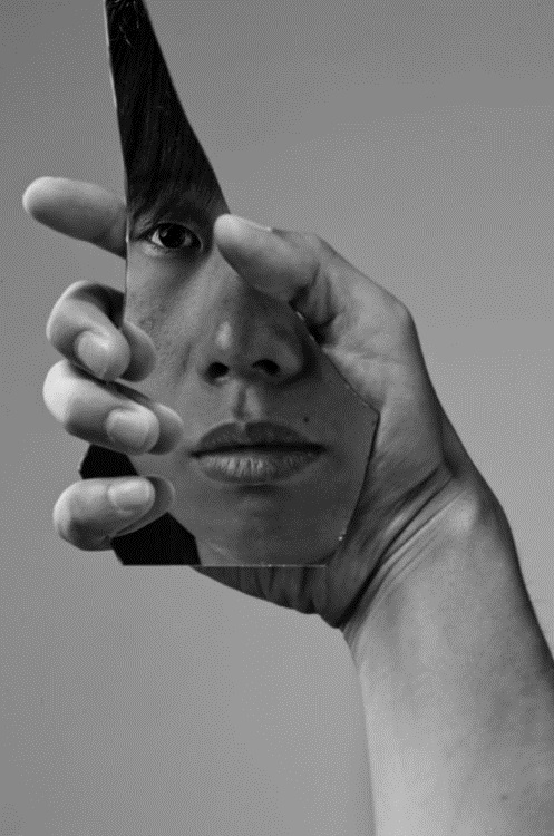
Image Courtesy – Alex Bohn Photography
A well-composed photograph draws the viewer’s attention to the subject, while a poorly composed photograph can leave the viewer feeling uninterested and disconnected. Composition allows photographers to tell a story or convey emotion through their images and helps them to communicate their artistic vision effectively.
Photographers must pay close attention to the placement of the subject, the use of lines and shapes, the balance of light and dark areas, and the overall visual flow of the image. By mastering the principles of composition, photographers can elevate their work and create images that are both aesthetically pleasing and emotionally impactful!
Rule Of Thirds
Source – Photzy
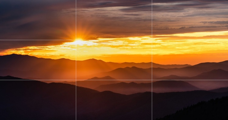
The rule of thirds is a fundamental principle in photography composition that involves dividing an image into thirds, both horizontally and vertically, resulting in a grid with nine equal parts. The four points where the lines intersect are known as “points of interest,” and these points are where the photographer should consider placing the main subject of the photo.
By placing the subject on one of these points, rather than directly in the center of the frame, the photo becomes more visually appealing and balanced, creating a sense of tension, energy, and movement that draws the viewer’s eye towards the subject. The rule of thirds is a powerful tool that can help photographers create more engaging and dynamic images that capture the viewer’s attention and leave a lasting impression.
Leading Lines
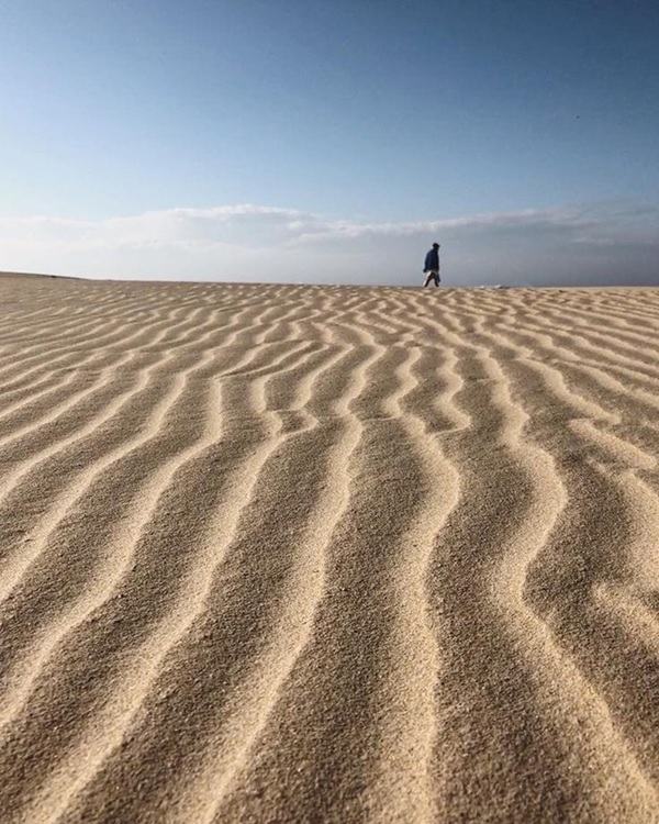
In photography, leading lines are a composition technique that uses actual or implied lines to draw the viewer’s eye toward the main subject of the photo. These lines can be horizontal, vertical, diagonal, curved, or even implied by the direction of objects in the photo.
Photographed by @alice1280, Source – Mobiography.net
Leading lines are used to create a sense of depth and perspective in the photo, as they guide the viewer’s eye toward the main point of interest. They also add a sense of movement and flow to the photo, making it more dynamic and engaging.
Examples of leading lines in photography include roads, pathways, fences, buildings, bridges, and even natural elements like rivers, mountains, and tree lines. When used effectively, leading lines can create a strong visual impact, making the photo more memorable and captivating.
Symmetry & Balance
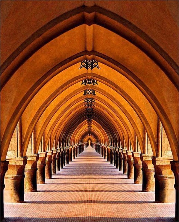
Photo by Katarina 2353 on Flickr
When a photo is symmetrical, it means that it can be divided into equal halves, and the two sides of the image mirror each other. Balance, on the other hand, refers to the distribution of visual weight within a photograph. It ensures that elements within the image are arranged in such a way that they create a sense of equilibrium and stability.
Symmetry and balance help create a sense of order and structure within an image. They help guide the viewer’s eye toward the main subject of the photo, creating a sense of harmony and balance that makes the image more visually appealing. When an image is unbalanced or lacks symmetry, it can be jarring to the viewer, making it difficult to focus on the main subject of the photo.
In addition to creating visual harmony, symmetry, and balance can also be used to convey meaning and emotions in a photograph. For example, symmetrical images can create a sense of stability and order, while asymmetrical images can create a sense of tension and movement. By playing with the balance and symmetry of elements within a photo, a photographer can create a wide range of visual effects that help convey the emotions and ideas they wish to express.
Color & Contrast
Colors can evoke emotions and feelings, and when used effectively, they can enhance the composition of an image. For instance, a monochromatic color scheme can create a sense of calm and serenity, while contrasting colors can make an image more dynamic and exciting. Bright and bold colors can create a sense of energy, while muted or desaturated colors can create a more subdued and introspective mood.
Contrast, on the other hand, refers to the difference between light and dark tones in a photograph. It can add depth, texture, and interest to an image. For instance, a high-contrast image with deep shadows and bright highlights can create a dramatic and powerful effect. On the other hand, a low-contrast image with subtle tonal differences can create a softer and more ethereal mood.

Venice, 1990 © Franco Fontana, Courtesy of Baudoin Lebon Gallery and Photo London
Color and contrast can also be used to create visual balance in a photograph. Balancing colors and tones can make an image more harmonious and visually appealing. For instance, a photograph with a dominant color can be balanced by introducing smaller amounts of complementary colors. Similarly, balancing light and dark tones can create a sense of stability and harmony in a photograph.
Framing and Cropping
Framing refers to the use of elements within the scene to create a frame around the subject, drawing the viewer’s attention to the main point of interest. The frame can be created by natural elements such as trees or man-made structures like arches, doorways, or windows. Framing can also be done through post-processing techniques like adding borders to the image.

Photographed by Tosca Luchese, Courtesy – Pinterest
For example, a photograph of a person standing under an archway will create a natural frame around the subject. The viewer’s attention will be drawn toward the person, creating a more focused and impactful image. Another example is the use of trees or foliage to create a natural frame around the subject, as seen in landscape photography.
Cropping, on the other hand, involves cutting or trimming parts of the image to improve its composition. Cropping can help to eliminate distracting elements, focus on the main subject, or create a new perspective on the image. Cropping can be done either in-camera or during post-processing.
For example, cropping can be used to eliminate unwanted elements in the foreground or background of an image, creating a cleaner and more focused composition. Cropping can also be used to change the aspect ratio of the image, allowing the photographer to experiment with different framing options.
Both framing and cropping are important because they can help to enhance the visual impact of an image. By using framing, a photographer can create a sense of depth and dimensionality in the image, drawing the viewer’s attention to the subject. Cropping, on the other hand, can help to eliminate distractions and create a more cohesive composition.
Patterns, Perspective & Negative Space
Patterns refer to the repetition of shapes, colors, or textures in an image. A pattern can create visual interest and lead the viewer’s eye throughout the photograph. Photographers can use patterns to convey a sense of rhythm or order or to create a sense of chaos or randomness.
Perspective refers to the angle or point of view from which a photograph is taken. It can add depth and dimension to an image and can create a sense of scale or distance. Photographers can use perspective in their photos to create an illusion of depth or to emphasize certain elements

Image Courtesy – Jason Peterson Photography
Negative space is the area around the subject of a photograph that is left intentionally blank or unoccupied. It can help draw attention to the subject and create a sense of balance or simplicity in the composition. Using Negative space can also create a feeling of emptiness or isolation, depending on how it is used.
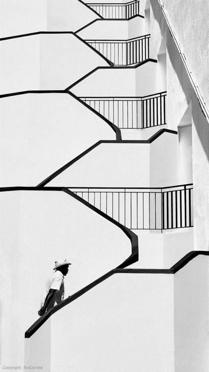
My Baby Left Me by Rui Correia, from Pinterest
For example, a photograph of a building with a repeating pattern of windows can create a sense of order and rhythm. A photograph taken from a low angle can create a sense of grandeur or dominance, while a photograph taken from a high angle can make a subject appear small or insignificant. Finally, a portrait with negative space around the subject can create a sense of intimacy or vulnerability.
Foreground, Middle Ground, and Background
Foreground refers to the closest part of the scene to the camera. It can be used to provide context to the image and create a sense of depth. For example, a photographer taking a picture of a landscape may use the foreground to include elements such as rocks, flowers, or a fence to give the viewer a sense of being part of the scene.
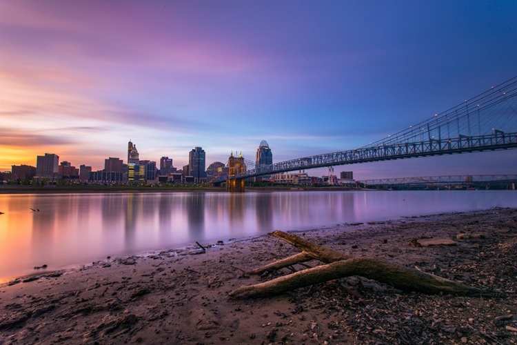
Image Courtesy – Digital Photography Review, Cincy Sunset by Nathan Pentecost
Middle ground refers to the area between the foreground and the background. It can be used to create a visual bridge between the two areas and provide additional details or elements of interest to the image. For example, a photographer taking a picture of a cityscape may use the middle ground to include elements such as buildings, people, or trees to add depth and interest to the image.
Background refers to the farthest part of the scene from the camera. It can be used to provide context and contrast to the foreground and middle ground. For example, a photographer taking a picture of a sunset may use the background to include elements such as mountains or clouds to create a dramatic contrast with the warm tones of the sun.
In conclusion, shoot away. The more you shoot, the more you’ll learn about composition. Find the order in chaos, rhythm in the mayhem, and symmetry in the jumble. Let your pictures become unforgettable by using composition!


